New desktop setup
Introduction
I haven’t had the time to tweak my desktop in over a year, I’ve been mostly stuck with the default settings of Fedora (GNOME) and slowly tweaked things, before that, a Plasma/i3 setup (which was awesome!). I’ve had a long run of different setups over the last couple of decades… AwesomeWM, i3, KDE 2/3, GNOME 2/3/4, XFCE, etc.
Using GNOME full-time has been fine, but not great. It is a dependable and well-working desktop environment out-of-the-box, but that is as far as that goes
- With every update, extensions break
- Hardly any customization options anymore
- Requires too many extensions to change basic settings
- It still feels restricted
- No proper information is displayed
For me, I like key information and easy access to things by both keyboard (mainly) and mouse. I’m a little old school in that sense… preferring information to eye candy. The days of everyone having CPU graphs, cool Conky configs, panels with functionality, and so on, seem to be a thing of the past for many users; which is fine! That is their choice. It just does not suit mine.
The workflow GNOME offers, by default, has all those sorts of things very hidden or non-existent.
- No list of open windows
- No indication of what desktop you’re viewing
- No quick access to device settings (Bluetooth, sound, wifi, etc.)
- Did I say you need a lot of extensions yet?
I simply miss my old XFCE and GNOME 2 layout of the early 2000s – the peak of the Linux Desktop, in my opinion, something which KDE continues to do with Plasma (I have my preferences with Plasma, but I will not get into it for this post).
Trying with GNOME
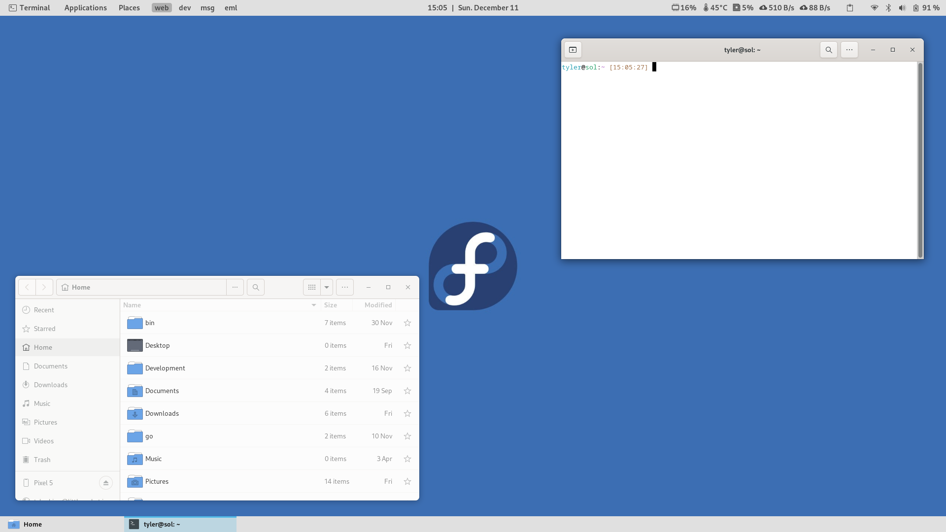
To achieve an XFCE/GNOME 2 setup, I attempted several ways, which worked out decently well! But, of course, required a lot of extensions and a theme.
The above screenshot is an example of the resulting setup which has a similar feel to the old layout… two panels with proper information.
To achieve this, it required the following extensions:
- Applications Menu: To get the application menu as GNOME 2 had
- Clipboard History: To have a history of clipboard information, like gPaste
- Dash to Panel: To get the bottom panel with the task list enabled
- Date Menu Formatter: To be able to format a date how we need
- Disable Workspace Switch Animation: To disable the slow animations switching workspaces
- Hide Activities Button: Because Activities is useless
- Order Gnome Shell Extensions: To be able to order the extensions on the top right of the panel
- Sound Input & Output Chooser: To be able to change the sound devices easily
- Vitals: To show some stats (CPU, fans, memory, net, etc)
- Workspaces Bar: To show the list of workspaces
- Places Indicator: To show the Places menu as GNOME 2 had
And the following theme is to be downloaded: GNOME Theme Default Light.
All-in-all, it worked well. But an instant update recently killed a few extensions and I simply got fed up.
As I said, GNOME works well out of the box, the second you start tacking on a bulk of extensions to backfill some functionality, it breaks down. Not only that, GNOME visually does a great job with the unification of applications, dialogs, themes, etc, it’s very consistent. It’s a shame they took such a radical direction away from GNOME 2 which was a tried and true base.
Exploring Alternatives
I decided to give XFCE a whirl again, I haven’t used it in maybe 5 or 6 years. With XFCE still being actively developed, and pushing for a Wayland implementation in future releases, it seemed like a good avenue. Short and sweet result: consistency was hard to get between various applications which affected my workflow, I’ll skip the details as it’s simply an opinion.
Next, a toss-up between MATE and Cinnamon (which I had not yet tried). My gut told me to try Cinnamon; it is very actively developed by the Linux Mint team, and its offered as a spin for Fedora, so I took the plunge and installed the meta package through DNF on Fedora for the complete desktop package. To be honest, I did not give MATE a real chance (yet), since I found everything I needed with Cinnamon!
Cinnamon
Without touching anything on the base Cinnamon install, it was already impressive to me. It has a task list, workspace indicators, and menus, and as a bonus, it had a consistent look and a ton of settings! Settings that felt familiar, felt like I had some control over my desktop again.
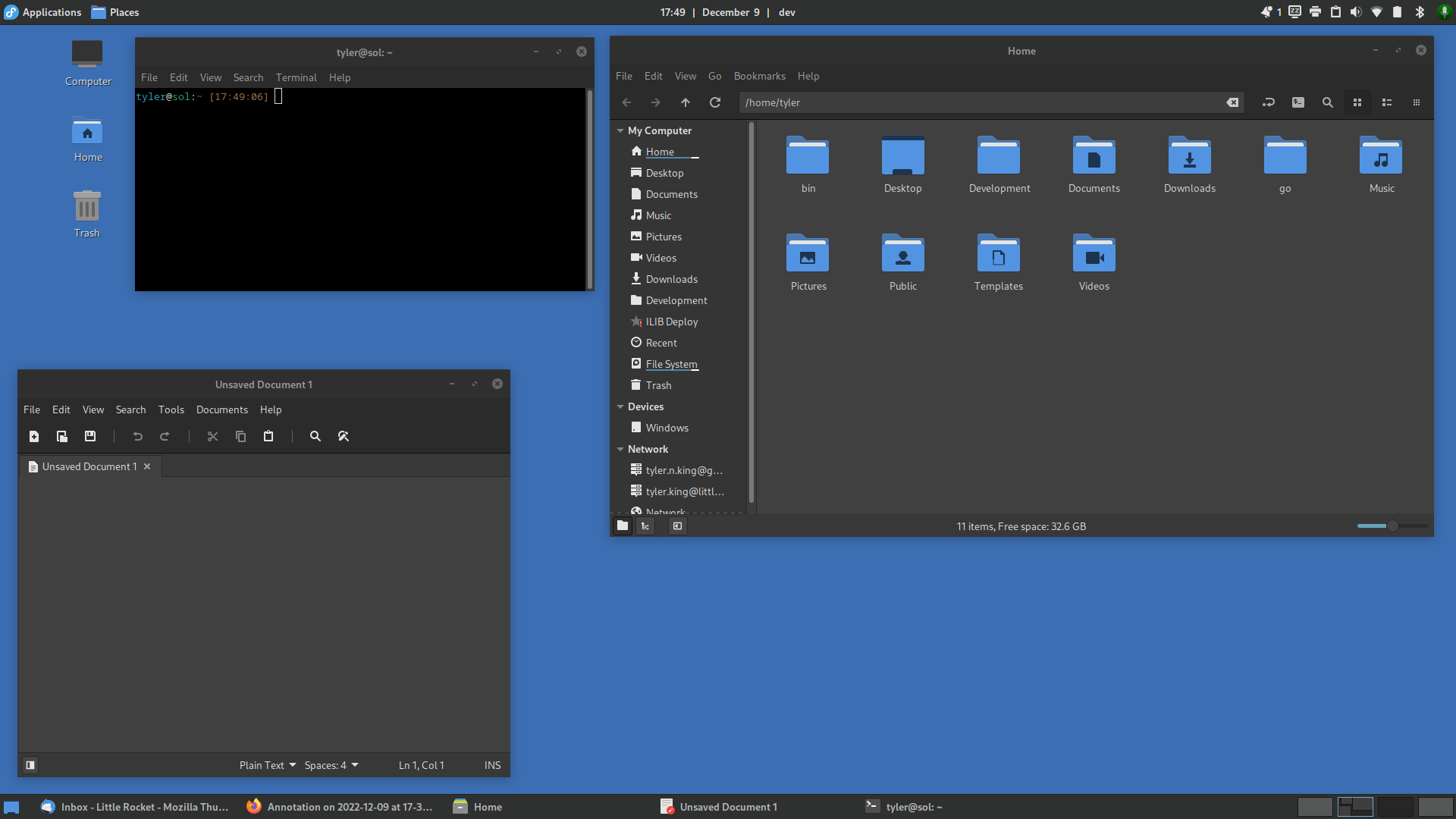
I hunkered down for 20 minutes and produced an initial desktop which got me back to my feeling of my old XFCE and GNOME 2 desktops:
It’s everything I need to visually see at the moment (minus some system stats which I had not yet tackled). It is also consistent. The Linux Mint team has done a great job to build Cinnamon away from GNOME Shell but still provide a consistent look between applications for a bit of a bonus on the eyes.
I can fully configure shortcuts, the panels, how I need the file manager to work, my desktop to function, etc., and all are done with minimal extensions (called Spices in Cinnamon).
Top bar:
- Default applications menu: Tweaked with Fedora logo and label
- Places indicator: A Spice to add Places menu
-
Default DateTime: With a custom format to add a
|(pipe) at the end of the time - Current workspace: A Spice to show the current workspace name
- Default systray: Tray and X-Apps, and lastly, a mic toggle (click and keyboard)
Bottom bar:
- Default show desktop: No tweaks
- Default window list: Minor tweak to the Python code to increase the window name length
- Default workspaces: No tweaks
Theming:
- Icons: Papirus
- GTK/WM theme: Mint-Y-Dark-Aqua
- Desktop theme: Mint-Y-Dark-Aqua (but Cinnamon default is nice too!)
Additionally, Mint’s “X-Apps” work well and are customizable as I like. As well, Nemo, is much more full featured than Nautilus, it actually shows informations and has meaningful settings.
All-in-all, I am very happy. Cinnamon for my week of using it is a great, well-thought-out desktop which brings back the feeling of nostalgia and control again.

